[su_button url=”https://pinterest.com/pin/create/button/?url=http%3A//tpoddesign.com/brand-identity/&media=http%3A//tpoddesign.com/wp-content/uploads/2016/07/Brand-Identity_Pint.png&description=What%20is%20brand%20identity?%20Brand%20identity%20is%20a%20complex%20mix%20of%20visuals,%20message,%20culture%20and%20expertise.%20This%20post%20focuses%20on%20your%20visual%20elements,%20such%20as%20logo,%20colors,%20and%20fonts.” target=”blank” style=”soft” background=”#BC0D1E” icon=”icon: pinterest” rel=”nofollow”]Pin This Post![/su_button]
I get this question from time to time, especially when people see my Brand Identity Package. In part, it’s all of the visual elements that make up your brand including your logo, logo variations, sub mark/brand mark, patterns, textures, fonts, and graphics. Your brand identity is how your company is seen as a whole based on those pieces and the less tangible things, such as your message and culture.
If you’re on my site you probably know that branding is important. Instead, let’s talk about the visual pieces that make your brand identity. I’ll use examples from a previous design to show you what the pieces are and give you tips for each piece.
Your Logo
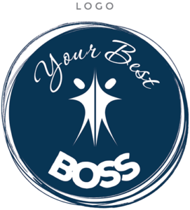
This is the piece everyone talks about. Odds are, you already know you need one, and perhaps have one. Your logo is the centerpiece of your brand identity, and should look good on screen, on your business card, or on a poster.
Too often I’ll see entrepreneurs get a logo for free or cheap, and when they receive one large jpg of the logo, they think they’re fine. Wrong. You should always receive a vector logo, which will have file extensions like ai, svg, and eps. It might not be a file you can open, but I promise you that any professional designer or printer you work with will want it. That’s because a vector logo can be scaled to any size without losing quality! It will look the same on a billboard as it will on a sticker, business card, letterhead, website, or anything else you need to brand. Without a vector version, you may pay more to designers down the road who have to spend extra time compensating for this.

Logo Variations
Pretty straightforward, right? A logo variation is a logo that’s slightly different so you have some flexibility. Often, the colors will be different, or a logo with stacked text will run wide instead. Sometimes it’s a version with a texture, such as metallic foil or glitter. Your logo variation will be used less often, but will play an integral part of your brand identity. It gets used in places where your regular logo just might not look right.
Again, you’re going to want a vector version of this, and there may be more than one variation. If it’s a version with texture, find out if you’ll be receiving the texture as part of your package; you may have trouble creating on-brand graphics down the road without it.

Sub Mark or Brand Mark
This is where I usually lose people! A sub mark or brand mark is usually a graphic element from the main logo. Sometimes, it’s a “seal” or round version of the logo. It’s almost always used as the favicon for a site, and is usually a good watermark for images, too. Some people also opt to use it in their social profiles, or on mini business cards — places their full logo might be too much. It’s great as a more subtle way to brand physical goods, too.
Your brand mark should be vector, too. (Seeing a theme here? 😉 ) While you should try to use your primary logo most often, your sub mark or brand mark may be used more than your alternate logo(s), and that’s okay! It’s another way to add flexibility to your brand identity, giving you room to grow.

Colors
You know what this is about. Your colors can convey your brand identity without any logo at all, if used correctly. They’re a pretty important aspect of your brand, as they should be used on everything you do, especially online. You should have 3-7 colors that are used regularly in your brand. Your designer may also opt to give you a sub-palette. That’s a collection of colors that complement your primary brand colors.
This is where many entrepreneurs make a basic branding mistake — they try to go with colors they like, rather than colors that will convey what they do. Unfortunately, those two things don’t always overlap. Just because you like muted, cool colors, doesn’t mean they’re a good choice for your aerobics and bootcamp-style personal training studio. A good designer will be able to help you find a happy medium. Make sure you discuss with your designer what ideas and emotions you’d like to evoke with your brand, as that will go a long way in deciding your colors.

Fonts
Fonts are integral to your brand identity, and logos are often comprised only of text. If that doesn’t make font choice important, I don’t know what will! These days, it’s not just your printed goods and graphics that can use your fonts, either. Using custom fonts on websites is now the norm, so your branding can be incredibly consistent across all media.
Naturally, you should be told what any fonts used in your logos and brand mark are. You should also receive other recommendations, though. That script font in your logo won’t look good as all of the text on your website, and a good brand designer will give you coordinating fonts to use. Two to three fonts is the norm. One for body copy, or paragraphs. One for headers and titles. Sometimes a third accent font.

Patterns, Textures, and Graphics
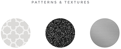
These are the often forgotten companions in your brand identity. You might not think of it during the original logo design process, but once you realize you could use one, you’ll really wish you had! I love them as web backgrounds, and have had a few clients use it as a desktop wallpaper or on their phone case. Plus, you can overlay text and create those quote images for social!
While sometimes your brand mark is a graphic in and of itself, more often you’ll find a need for little graphic elements down the road that are a bit different. For example, you might want a divider image to break up your newsletter. It’s a great idea to have a designer consider things like this when designing your brand identity.
Textures, of course, can also be used in similar ways as patterns. At the time of writing this, glitter textures are very popular, and metallic foils are often used to add elegance and a high-end appeal. While those things may not work for your brand, odds are there will be a texture that does, and it can be very helpful in keeping your brand cohesive in a subtle way.
While your graphics and patterns should probably be in vector format, it’s a bit rare to get textures that way. Fear not — most textures are very large, high-quality images that originate in print-ready spaces. You’ll probably receive a large jpg file for a texture, and that’s perfectly fine.
To Summarize
While your brand identity is about more than how your brand looks, the visual components are very important. You’ll want to have colors and fonts based on your brand’s ideals, and a logo set that conveys what you do very quickly. Your brand elements should be used consistently to instill trust and a sense of professionalism with your target market.
It’s important to choose a designer with more than just a good eye for aesthetics. They need to be aware of printing standards, web standards, and that your brand will need some flexibility to grow over time. If you’d like to discuss a Brand Identity Package, schedule your free consultation call.
[su_button url=”https://tpoddesign.com/product/brand-identity-design/” background=”#FF8737″ size=”8″ icon=”icon: check-square-o”]Learn More About A Custom Brand Identity Package[/su_button]
[su_button url=”http://tpoddesign.com/consultation” background=”#86699F” size=”5″ icon=”icon: phone”]Schedule Your Free Consultation[/su_button]
[su_button url=”https://pinterest.com/pin/create/button/?url=http%3A//tpoddesign.com/brand-identity/&media=http%3A//tpoddesign.com/wp-content/uploads/2016/07/Brand-Identity_Pint.png&description=What%20is%20brand%20identity?%20Brand%20identity%20is%20a%20complex%20mix%20of%20visuals,%20message,%20culture%20and%20expertise.%20This%20post%20focuses%20on%20your%20visual%20elements,%20such%20as%20logo,%20colors,%20and%20fonts.” target=”blank” style=”soft” background=”#BC0D1E” icon=”icon: pinterest” rel=”nofollow”]Pin This Post![/su_button]
